Post 4 — The most interesting pattern was not an ANOVA table
There is a particular plot I would always want to see when comparing analytical methods across matrices: the interaction plot.
Why?
Because it asks a very practical question:
Does the difference between methods change depending on the matrix?
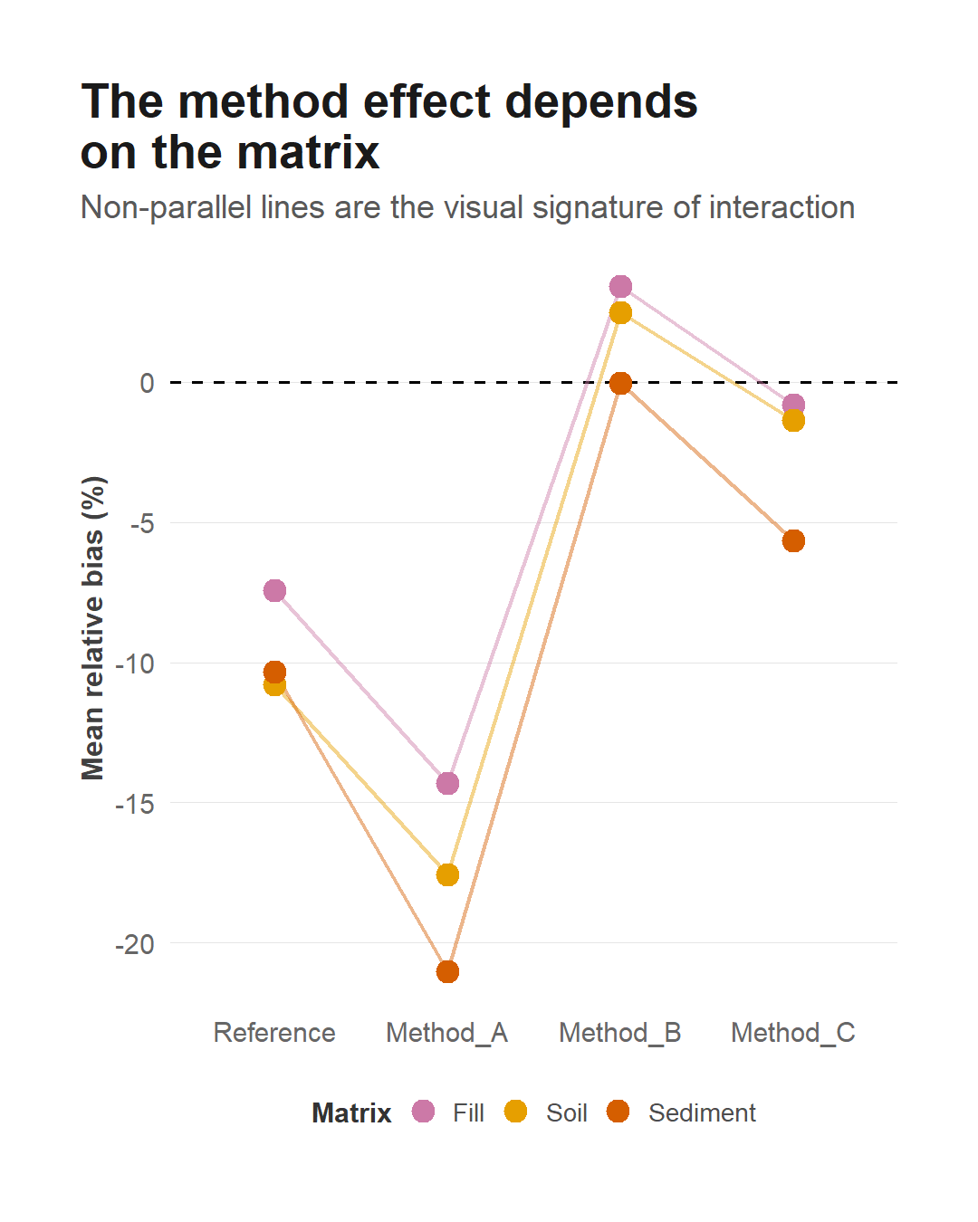
In the example dataset, three methods behave relatively consistently across Fill, Soil and Sediment.
Method A does not.
Its performance deteriorates substantially in Sediment.
That produces non-parallel lines in the interaction plot.
The formal model confirms that the Method × Matrix interaction is significant.
But the interesting part is not the p-value.
It is what the interaction means chemically.
If a method performs well in one matrix and poorly in another, there may be no meaningful answer to the question “Which method is best?”
The answer may instead be:
Which method is best for this matrix?
For Method A, the interaction is concentrated in Sediment. That immediately raises chemical questions about extraction efficiency, interference or matrix composition.
Statistics has detected the pattern.
It has not explained the mechanism.
That distinction matters.
An interaction is not evidence that we have discovered why the method fails. It tells us that the method effect is not constant across matrices.
And this is one of the reasons I find interactions more interesting than the traditional “main effects + p-values” presentation of ANOVA.
The model becomes a way of describing how analytical behaviour changes with experimental conditions.
Sometimes the most useful result is not:
“the interaction is significant.”
It is:
“this method behaves differently in this matrix, and now we have a chemical problem worth investigating.”
The implementation details and reproducible analysis for this step are available in the GitHub repository at https://github.com/andreabz/analytical-anova/ and on the project page at https://andreabz.github.io/analytical-anova/